Running Springs Farmers Market & Artisan Faire · Brand identity case study

An elevated brand for The Rim’s original farmers market, and a website built on it

We refreshed the Running Springs Farmers Market & Artisan Faire’s logo without losing what locals recognized, built a brand system around it, and launched a marketing website on that brand in under three weeks, ahead of the market’s 15th season.

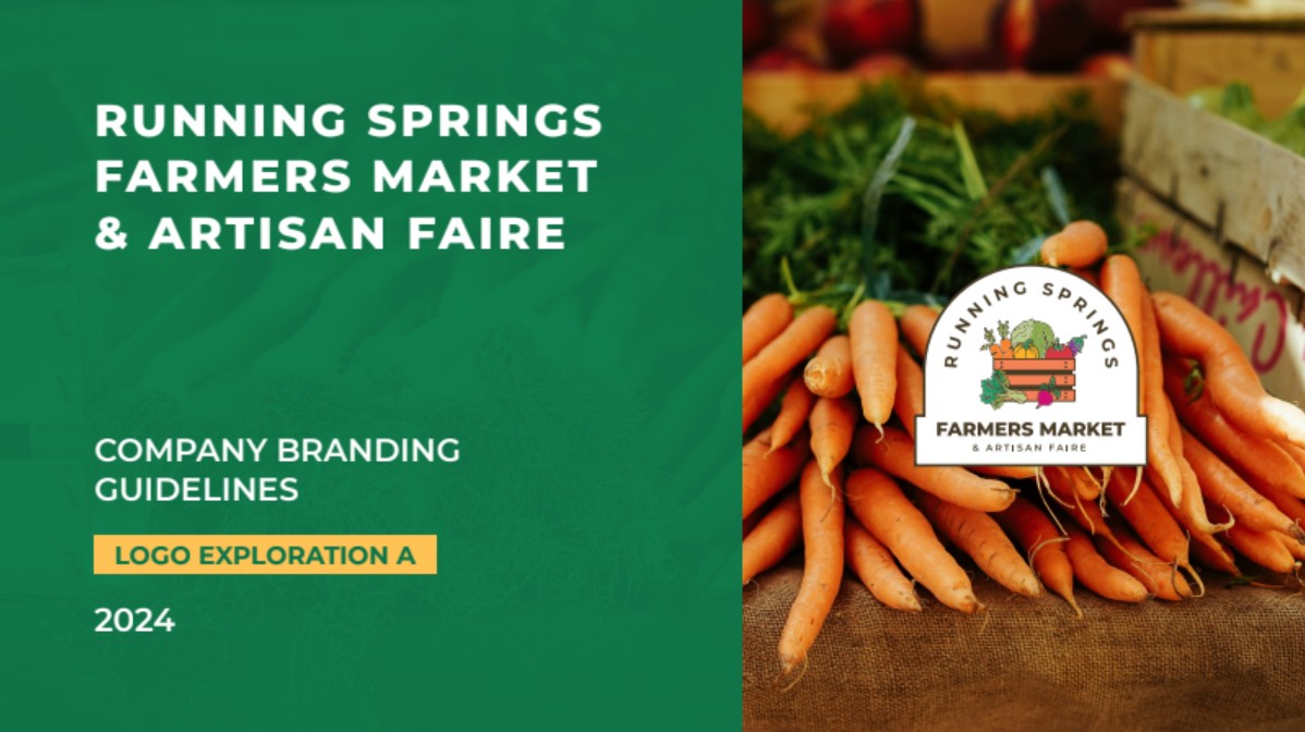
Cover of the Running Springs Farmers Market & Artisan Faire branding guidelines, with the new arched badge logo over a photo of fresh carrots.

Key outcomes

< 3 weeks
from the first website concept to launch, ahead of the market’s 15th-season opening day
5
logo formats, from a full badge for banners to an icon for favicons and social avatars
4
paths on the website, one for each reason people come (plan a visit, find vendors, sell at the market, and spend the day)

Project at a glance

Client
The Running Springs Farmers Market & Artisan Faire, a California certified farmers market founded in 2012 and run by volunteers through the Running Springs Area Chamber of Commerce. It meets every Saturday from April through November at more than 6,100 feet in the San Bernardino Mountains.
Audiences
Mountain residents, weekend visitors from the Inland Empire and Los Angeles area, certified growers, local artisans and food vendors, and sponsors
Services
Logo redesign, brand identity system, brand guidelines, illustration assets, website design and development, accessibility, privacy compliance, and analytics
Deliverables
Main, badge, alternate, submark, and icon logos; a color palette and type system; illustrated produce assets and seamless patterns; brand guidelines with sample applications; and a marketing website
Integrations
A live weekly vendor list from Farmspread, an interactive map, cookie consent management, and Google Analytics
Timeline
Brand identity, April to May 2024. Website, March to April 2026.
Engagement
The 2024 brand identity was a donated engagement, and a Digital Mountaineers Bridge Grant covered almost all of the cost of the 2026 website. Our founder has served on the Running Springs Area Chamber of Commerce board, so we knew the market and its community firsthand.

The challenge

The Running Springs Farmers Market & Artisan Faire is the oldest certified farmers market on The Rim. For more than a decade it grew on word of mouth, but newer markets had since opened on the mountain, and the original needed to look like the established destination it is.

  • No home of its own online. Shoppers and vendors pieced the market together from a vendor platform, a chamber event page, Facebook, Instagram, and an old Eventbrite listing.
  • A logo that had served its time. Locals knew the market’s illustrated produce basket, but the busy artwork and mixed type were hard to use small, on screens, or across signage and social media.
  • Recognition worth keeping. A clean break would have thrown away 12 years of familiarity. The new brand had to feel like the same market.
  • A volunteer team and a fixed season. Whatever we delivered had to be easy for volunteers to use and ready before opening day.

What success had to look like

  1. Keep the recognition the market had built over more than a decade
  2. Stand apart from newer markets on the mountain as The Rim’s original
  3. Give shoppers, vendors, and sponsors one place to find the market online
  4. Launch the website before the 2026 season opened

Our approach

We treated the market as one brand across every touchpoint, starting with the logo and ending with a website built on it.

  1. Phase 1April 2024

    Discovery and competitive review

    We reviewed the market’s existing logo, channels, and event photos, and looked at the newer markets on the mountain so the new brand would stand apart from them.

    Key deliverables

    • A review of the existing logo and where it appeared
    • A scan of other farmers market brands, locally and online
    • The brief to refresh, not replace
  2. Phase 2April to May 2024

    Logo exploration

    We explored several directions and recommended the one that kept the most of what people knew.

    Key deliverables

    • Four logo directions, each tested as a favicon
    • A recommended direction redrawn from the original produce
    • A side-by-side comparison with the existing logo
  3. Phase 3May 2024

    Brand system and guidelines

    We built the chosen logo into a complete identity the market’s volunteers could apply without a designer.

    Key deliverables

    • Main, badge, alternate, submark, and icon logos
    • Color palette, typography, illustrated produce, and seamless patterns
    • Brand guidelines with banner, social, and packaging examples
  4. Phase 4March 2026

    Website design and development

    When the chamber’s Farmers Market Committee asked for a site of its own, we designed it around the brand and the four reasons people visit, and refined it with the committee.

    Key deliverables

    • Website concepts reviewed by the committee
    • Content for visitors, vendors, and sponsors
    • A live vendor list, map, and parking guide
  5. Phase 5March to April 2026

    Launch readiness

    We prepared the site for the public before opening day.

    Key deliverables

    • Accessibility to WCAG 2.2 AA
    • A privacy policy, cookie policy, and consent management
    • Analytics, search setup, and image optimization

What we delivered

Built from the original

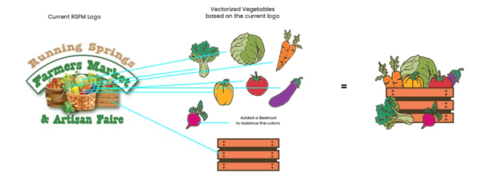
We redrew each vegetable from the market’s original logo as clean, consistent artwork and set them in a single crate. We added a beet to balance the colors.

Because every piece comes from the original, the new logo reads as the same market at a glance, only clearer, more confident, and easier to use.

Process diagram from the brand guide. Lines connect the produce in the original logo to redrawn broccoli, cabbage, carrot, pepper, tomato, eggplant, and an added beet, which combine with a wooden crate into the new logo mark.

A logo system for every format

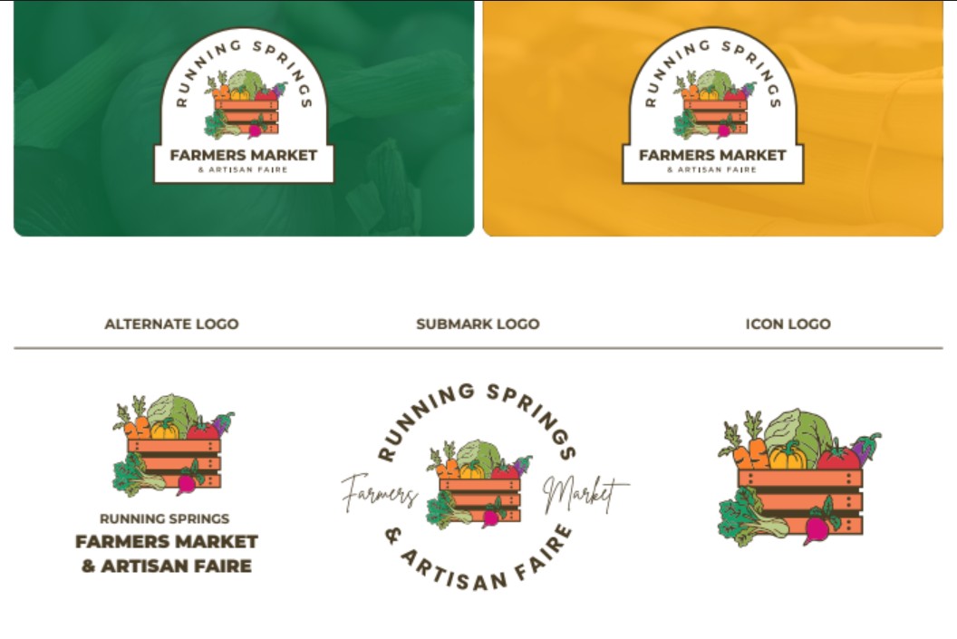
The main logo works on signs and flyers. An arched badge holds up on photos and color, an alternate logo fits narrow spaces, a submark adds a handwritten touch for merchandise, and the crate icon works as a favicon or social avatar.

Brand guide page showing the arched badge logo on green and gold photo backgrounds, above an alternate stacked logo, a circular submark with “Farmers Market” in script, and the crate-of-produce icon.

A brand that works at market and online

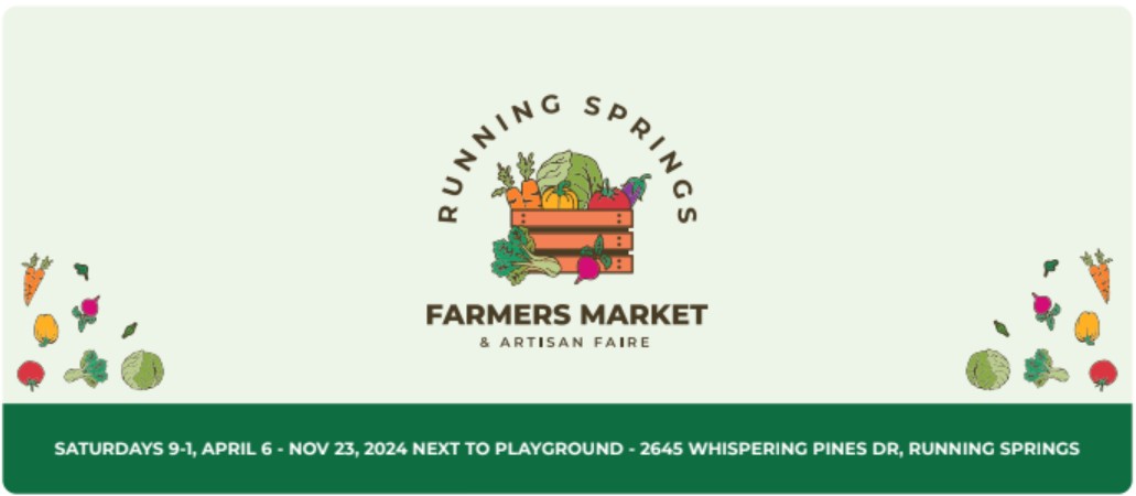
The guidelines show the brand in use, from a market banner with the season’s dates to square social posts. The illustrated produce doubles as a pattern, so volunteers can make on-brand graphics from a small set of parts.

Sample market banner with the new logo centered between illustrated vegetables, above a green band reading “Saturdays 9–1, April 6 – Nov 23, 2024, next to playground, 2645 Whispering Pines Dr, Running Springs.”

Ready-made social graphics

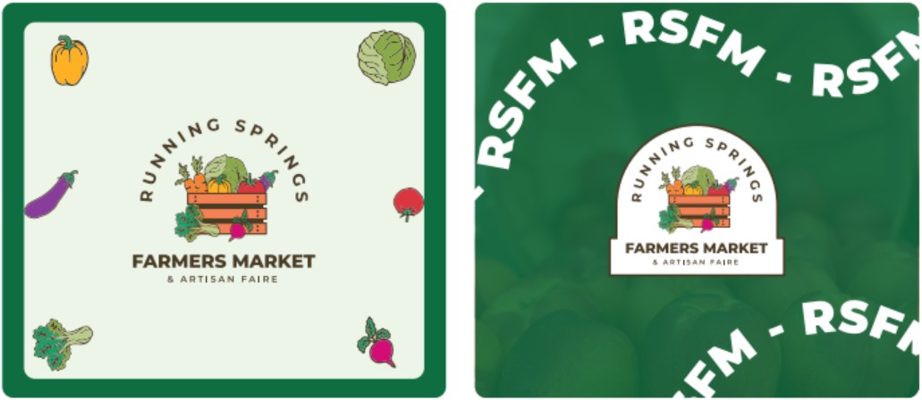
Square templates in the brand’s green, cream, and produce colors give the market a consistent look in every post.

Two sample square social posts. One shows the main logo on cream with scattered vegetables in a green frame. The other shows the badge logo on a green photo background ringed by repeating “RSFM” text.

A marketing website built on the brand

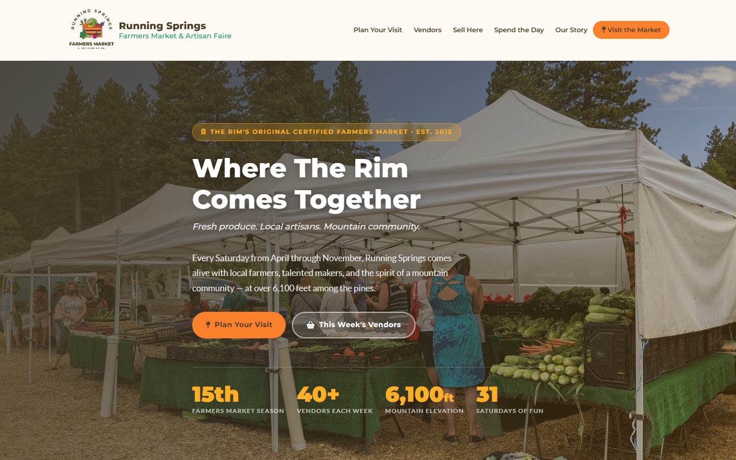
RunningSpringsFarmersMarket.com opens with the market’s story in numbers, then sends each visitor down the right path: planning a Saturday, finding this week’s vendors, applying to sell, or making a day of it in Running Springs.

It includes an interactive map and parking guide, drive times from across Southern California, a vendor list that updates itself each week from Farmspread, step-by-step vendor applications, and a sponsorship section. It links to Visit Running Springs, which we also built, so a morning at the market can turn into a day in town.

The Running Springs Farmers Market & Artisan Faire homepage, with the new badge logo, the headline “Where The Rim Comes Together,” a photo of shoppers at the produce tents, and stats for the 15th season, 40+ vendors, 6,100 feet of elevation, and 31 Saturdays.

Before and after

Before

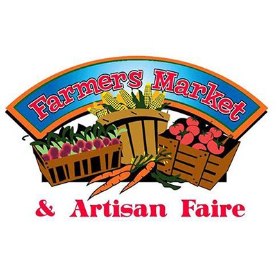
The original logo, an arched blue banner reading “Farmers Market” over illustrated baskets of corn, tomatoes, beets, and carrots, with “& Artisan Faire” in red below.

After

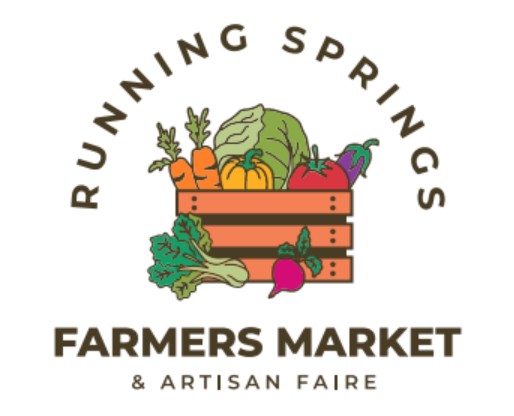
The refreshed logo, with “Running Springs” arched over a crate of illustrated produce and “Farmers Market & Artisan Faire” in bold type below.
The market’s original logo (before) and the refreshed logo (after)

Results

The refreshed brand now represents the market on its website and in its materials. The website went live in under three weeks from the first concept, ahead of the market’s 15th-season opening day on April 25, 2026, and the market announced it to its mailing list as part of the season kickoff.

For the first time, shoppers, vendors, and sponsors have one place to find everything about the market, presented as the established, high-quality destination it is.

Goals, what we delivered, and the evidence
GoalWhat we deliveredEvidence
Keep the recognition the market had builtA logo redrawn from the original produce, in a cleaner and more flexible systemProcess documented in the 2024 brand guidelines.
Stand apart as The Rim’s originalA distinct badge, palette, and illustration style, and a website that leads with the market’s historyThe site opens with “The Rim’s Original Certified Farmers Market · Est. 2012.”
Give shoppers, vendors, and sponsors one place onlineA marketing website with paths for visitors, vendors, and sponsors, and a vendor list that updates itselfrunningspringsfarmersmarket.com, live since spring 2026.
Launch before the 2026 seasonFirst concept to launch in under three weeksFirst concept in late March 2026; launch announced April 12, 2026; opening day April 25, 2026.

Sources: project messages and design files, April to May 2024 and March to April 2026; Running Springs Farmers Market & Artisan Faire branding guidelines (2024); the market’s 2026 season announcement, April 12, 2026; runningspringsfarmersmarket.com, October 2026.

An ongoing partnership

We continue to work with the Running Springs community, including the Running Springs Area Chamber of Commerce and Visit Running Springs.

Is this project like yours?

This case study is most relevant if your organization:

  • Is a community event, market, or festival with years of local recognition
  • Has a logo people know but that no longer fits how it’s used today
  • Has information scattered across social media, event listings, and third-party platforms
  • Relies on volunteers to keep its brand consistent
  • Needs a brand and website ready before a fixed season or event date

Capabilities demonstrated

  • Logo design and redesign
  • Brand identity systems
  • Brand guidelines
  • Illustration and pattern assets
  • Marketing websites
  • Accessibility (WCAG 2.2 AA)
  • Privacy and consent compliance

Planning a redesign or issuing an RFP?

We'd welcome the chance to bid. Tell us about your timeline and requirements, and we'll share relevant work, references, and an approach tailored to your organization.

← All Our Work