Design rooted in the center's own culture
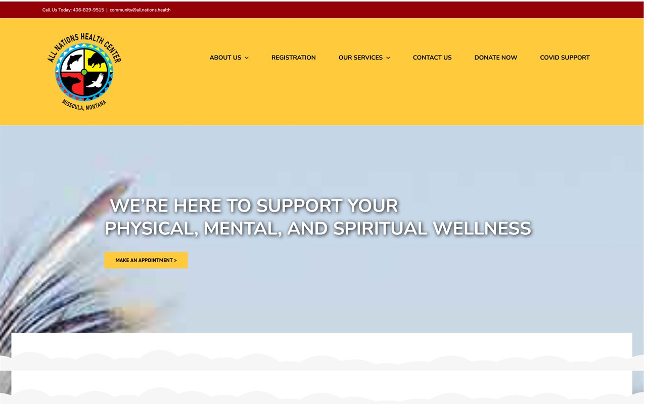
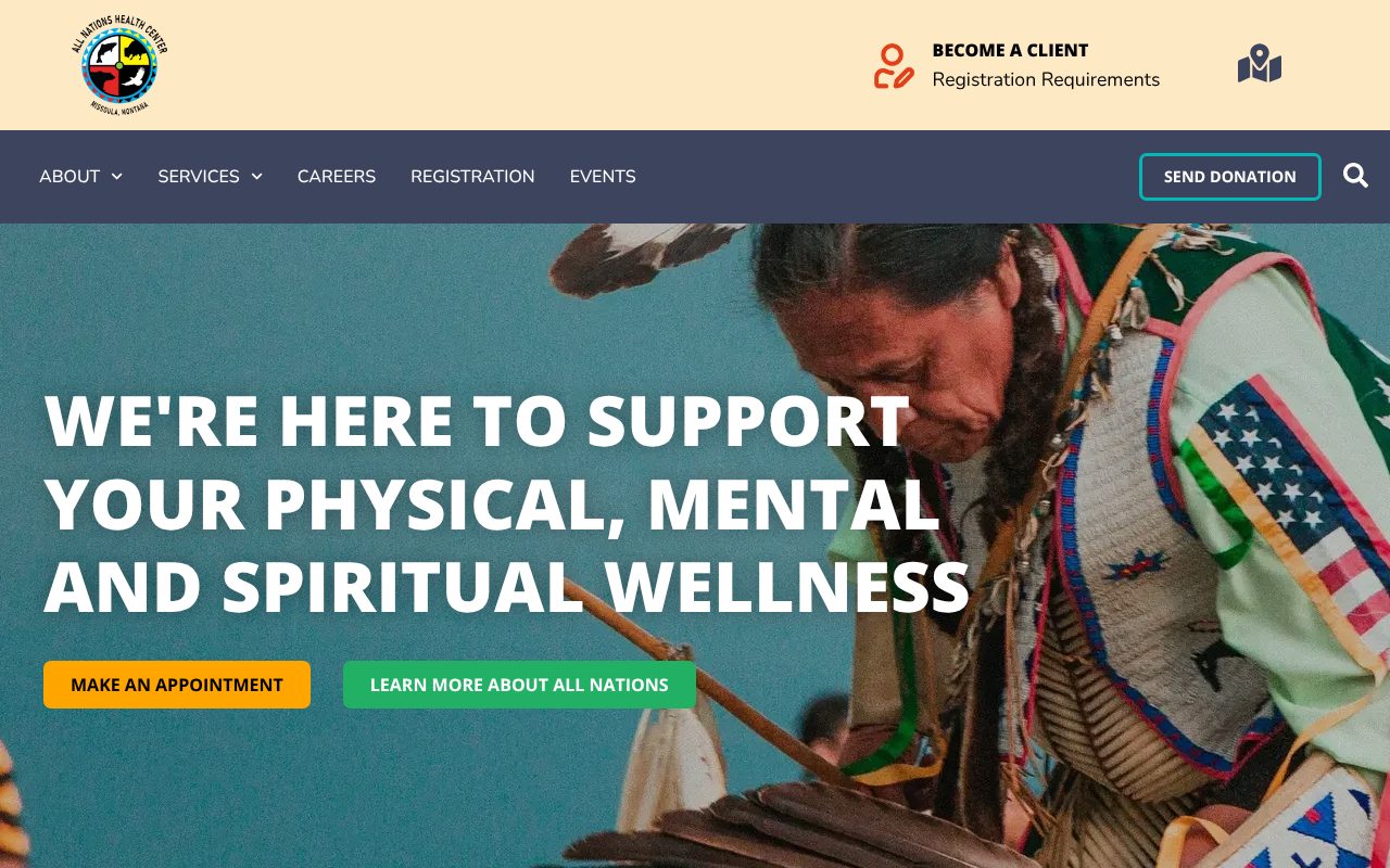
Every Indigenous nation has its own art, colors, and iconography. When the first homepage concept didn't yet feel like All Nations, the center was willing to move ahead and revisit the design later. We held development instead, because the look of the site would shape everything built on it.
The center's team sent us the references that mattered to them, including floral designs, regalia, and artwork of the center's own, and we refined the design with them round by round:
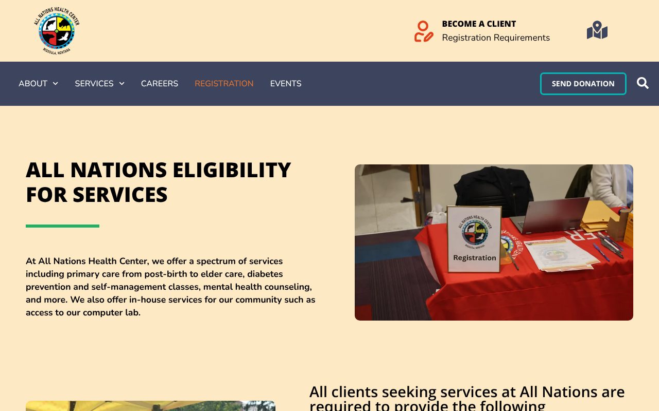
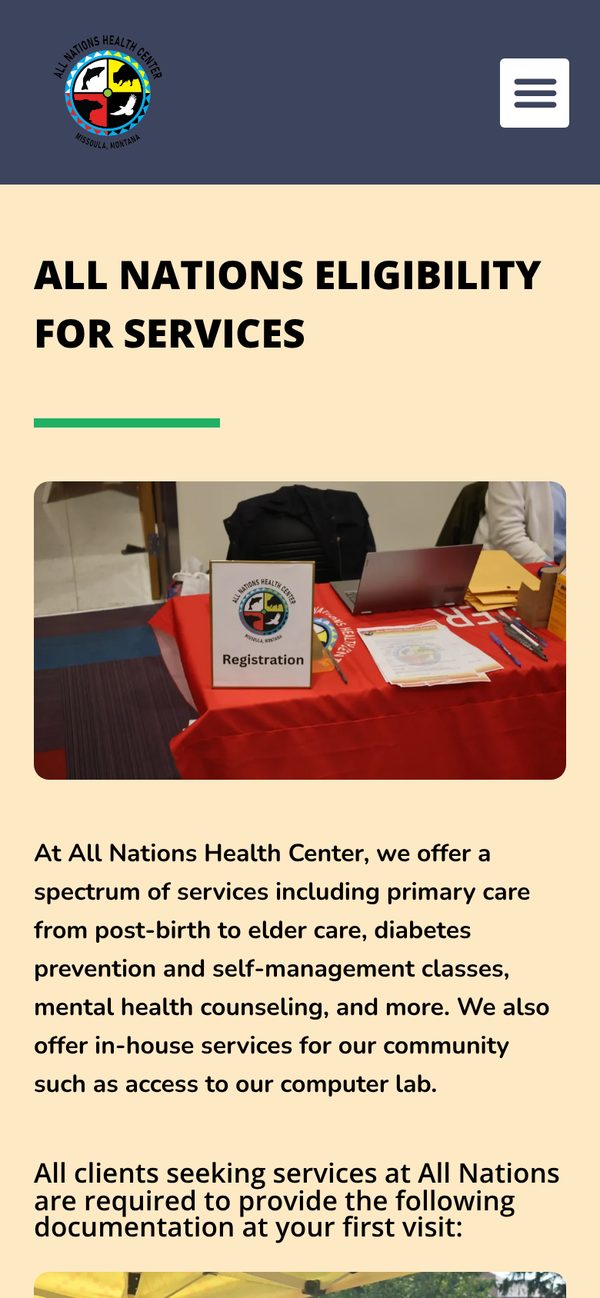
- Colors from the center's world: the palette builds on the center's logo, with deep plum and sangria reds the team chose in place of a brown they didn't like
- Patterns the center chose: floral designs, recreated by hand from the ones the team circled, and a patterned band above the footer
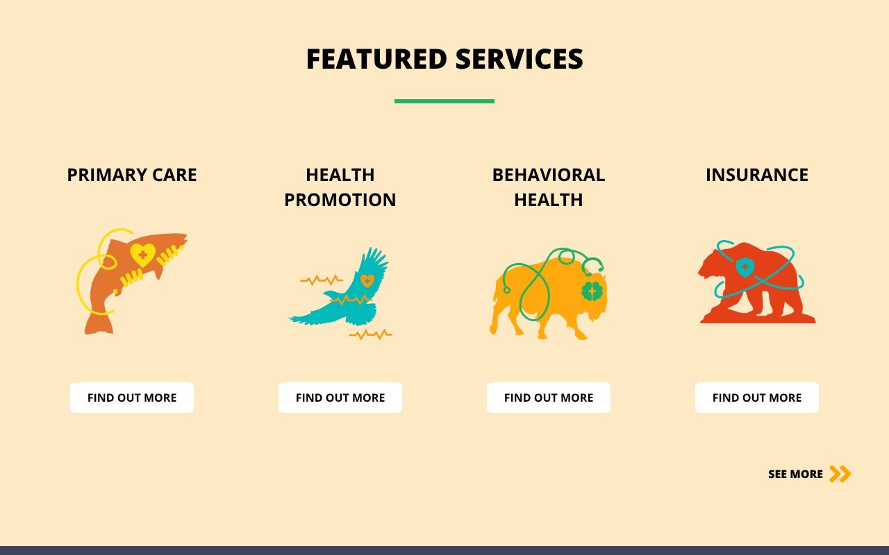
- Illustrated services: a fish, an eagle, a bison, and a bear mark Primary Care, Health Promotion, Behavioral Health, and Insurance, building on motifs the center suggested
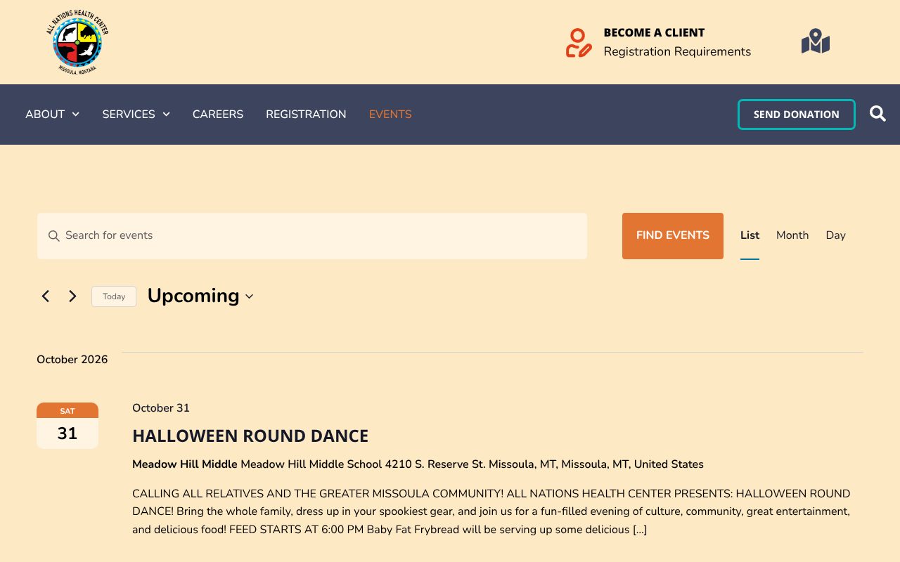
- Calm enough for a clinic: we toned down busy dividers and loud imagery so the site welcomes visitors of every age who are looking for care
The center approved the final homepage the morning it arrived.